Kasheer: Where my money at?
Cross-platform expense tracker application

TL;DR
I led the design and development of Kasheer, a cross-platform expense tracker app, from idea to production-ready MVP as CTO and Tech Lead in a small startup. I handled everything from requirements gathering, UI/UX, and coding standards to infrastructure and deployments. Despite not launching commercially, the project taught me valuable lessons in product development, team leadership, and technical architecture. The app features a streamlined expense entry flow, offline-first support, and insightful reporting, all built with React, Cordova, OrbitJS, and MongoDB.
Introduction
A young human wakes up one day wondering how, despite earning a decent salary, they never manage to set aside enough for bigger goals — like an emergency fund, investments, or vacations. Money comes and goes without much thought, and those big goals seem farther away than ever. Of course, financial education was scarce at best in a developing country. But there’s no time to learn now — action must be taken. All we know is that we need to find out where our money is leaking and regain control of our personal finances. But how?
Enter Kasheer, the expense tracker app specifically built to answer the burning question: Where my money at?. It does this by providing:
- an incredibly simple, fast but guided expense recording process
- a seamless offline-first, cross-platform experience (web and mobile)
- meaningful reporting of where your money is going
 The Kasheer app on multiple devices
Team and Timeline
A friend and I founded a small startup idea, Sandone Apps, during the Covid-19 pandemic. He acted as CEO, while I took on Tech Lead responsibilities as CTO. For Kasheer, we collaborated remotely with a junior frontend developer, and relied on our families for testing.
We worked on the MVP for Kasheer in our spare time from mid 2020 to early 2021, holding weekly meetings whenever our schedules aligned. We reached Closed Alpha on the Google Play store, and the staging environment is still available as a web app at https://kasheer.sandoneapps.com. However, due to the legal environment at the time and other challenges, we were unable to establish a company behind the product or properly publish it.
As a result, there was no official release, no marketing, and only minimal maintenance until the project was eventually abandoned. The mobile app was unlisted due to inactivity, but I kept the website domain alive for historical purposes. Our CEO used the staging environment while it was active and Kasheer worked well, recording a few hundred expenses in about a year or so. Even though the project never reached the open market, I am proud to have driven it from ideation to a production-ready MVP.
My Role
In a small startup, roles are often fluid and there is always plenty to do. Some responsibilities I took on proactively; others emerged as the project evolved:
- Collecting and refining technical requirements from business ideas
- Project UI/UX including branding, store listing graphics and application design
- Configuring project management Kanban board in Trello
- Writing and assigning work items
- Implementing and upholding coding standards
- Designing and setting up an offline-first architecture
- Developing core frontend functionality and refactoring parts of the backend as needed
- Provisioning runtime infrastructure and handling both manual (Google Play) and automated (Render, MongoDB) deployments
One thing I didn’t get around to implementing was comprehensive error reporting and production monitoring. As a minimal solution I configured an uptime monitor to let us know of any major outages.
Main features
Adding expenses
The core user story in Kasheer is adding an expense. The landing page is intentionally designed as the entry point to a streamlined, four-step process:
- Select a
Category - Select a
Subcategory - Type an amount
- Click
Save
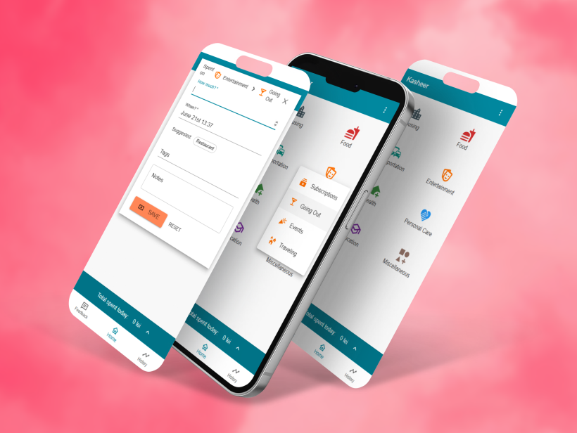 The expense entry process, from right to left
Our CEO envisioned this expense entry experience, and I fully supported the approach. The app targets entry-level users, who often find complex initial setups overwhelming. To address this, Kasheer offers a sane set of defaults, with plans for user customization in future releases. Additional optimizations, such as quick-access to frequently used subcategories, were added to the backlog to further reduce friction.
However, Kasheer is far from feature-poor. In addition to the amount, users can specify the date and time, add notes, and assign tags. Tags are one of my favourite features, as they significantly enhance the app’s value proposition. They add a new dimension to reporting, enabling users to analyze not just broad categories (e.g., Restaurants), but also specific details — such as which restaurants incur the highest expenses. A type-ahead autocomplete and a quick-add list of frequently used tags (tailored to each subcategory) make tagging both powerful and effortless.
Total spent today
At the bottom of the landing page, a clickable bar displays the user’s total spending for the day at a glance. For those interested in managing daily budgets, this panel offers immediate, actionable insight.
Tapping the bar expands it into a detailed list of today’s expenses, allowing users to quickly check, for example, if they’ve already purchased groceries and avoid duplicate spending. While this may seem unnecessary for solo users, we designed Kasheer with future family collaboration in mind. Aggregating expenses across family members would make this feature much more valuable with no additional development costs.
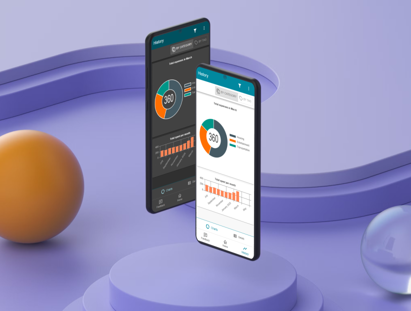
History
The main reporting area offers two primary modes: Charts for a high-level overview, and Details for in-depth analysis.
While the Charts provide a couple of straightforward visual summaries, the Details view offers comprehensive functionality. Users can drill down through Month > Category > Subcategory > Expenses, seamlessly transitioning from broad overviews to granular record management, including editing and deleting entries.
The Filters form and the By Tag/By Category toggle unlock deeper insights, revealing patterns in spending habits — crucial information for driving positive financial change.
Currently, only the past year’s expenses are displayed, with plans to monetize extended historical access in future versions.
Feedback
In lieu of comprehensive monitoring, we implemented a feedback section where users could submit comments or questions, and moderators could respond via email. Despite its simplicity, this feature proved highly intuitive and effective — our testers began using it immediately, even without us mentioning it.
Edit categories / subcategories
Currently restricted to admins, this feature allowed us to refine the default landing page configuration. We intended to make it available to all users following the release of personalized landing pages.
It’s basically a CRUD form for Categories and Subcategories, with JSON output that we just copied as-is into the database to update the landing page for all users.
Settings
The Settings screen, accessible via the account icon or adjacent menu, includes:
Dark modefor reasons that are easy to see.Currencyfor display purposes, no currency conversion is performed. We had plans for such a feature but it’s more involving than it seems — think editing a past expense in a foreign currency and changing the date.Email validationwas implemented usingSendInBlue(nowBrevo) to send a transactional email with a link the user can click to confirm email address ownership.Update tags countwas a last-minute hotfix for some tag counts that didn’t get properly updated in some scenarios we couldn’t properly reproduce and debug. It’s a clear example offault mitigationwhich gave us a tool to easily address possible user complaints until we found and fixed the underlying issue.Password resetfor basic security, with plans for enhanced session management and two-factor authentication.
Tech stack & Tools
Our tech stack included:
- Cordova for a single codebase to publish across platforms. We started with Web and Android apps since those were available to us at the time, with plans for iOS support post-release.
- React thanks to our familiarity with it, in addition to its well-known advantages.
- Material UI to achieve a native look on Android and a consistent appearance on the web. It provided a ready-made design system, accelerating MVP development. A custom UI was planned for a future major version.
- Orbit.js caught my attention early on as a great way to build offline-first, database-agnostic apps, offering significant flexibility over time.
- MongoDB for ease of management and deployment, which was sufficient for our initial needs. We considered switching databases only if necessary.
- FortuneJS with a JSON API Serializer to expose the
MongoDBdatabase as a consumable data source for theOrbit.jscoordinator.
For tools, we used:
- Render.com for free application hosting with custom domain support in the free tier.
- MongoDB.com for their free tier of database storage.
- Uptimerobot.com for free uptime monitoring of our web app (I still have the email alerts enabled).
- Trello.com for Kanban-style project management.
- VS Code as our primary code editor.
Branding
The application was originally named WMMA, a contraction of the tagline Where my money at?. Here are some early logo drafts:
 WMMA logos
From the outset, we struggled with the idea of conveying the full app name in the logo. The first one (left) served its purpose at the start of the project, when my focus was on architecture rather than branding. Later, after several feedback sessions, I created the logo on the right, trying to incorporate elements from the app’s name: the map marker for Where, gold coins for my money, and a reversed dollar sign doubling as a question mark for at?. In hindsight, this attempt to pack too much meaning into a small graphic (like a favicon or app icon on a phone screen) led to a loss of clarity. The key lesson: too much upfront detail can dilute the message.
A breakthrough came when our CEO took a step back and suggested the name Kasheer. While I wasn’t immediately convinced, it grew on me over time. After he implemented the History > Charts page with a distinctive donut chart, I saw the letter “K” in its negative space and realized its potential for branding. Inspired by a pitch method I’d seen from a professional designer I worked with on Lifechanger, I created the following graphic to showcase the flexibility of this negative space design (I’ll add a link to the Lifechanger article once it’s ready):
 Branding pitch for the Kasheer logo
I also created a few color variants, but the team immediately preferred this version. Based on it, I produced the media assets for the Google Play store listing (including app screenshots) and the favicon for the web app.
Frontend Development Highlights
Using the Material UI framework to create a unified UI that worked well on both desktop and mobile devices (phones and tablets) was pretty much straightforward. I went with a responsive yet simple and familiar layout in order to make everything easy to find, and my team contributed with great ideas for the page contents. We added dark mode support in response to valuable feedback from a good friend of mine.
 Kasheer theming variants
For a good mobile UI, the landing page features large icons and even larger active areas. Category buttons span the whole width of the device, ensuring that no matter where you tap, you interact with a button. The generous padding offered by Material UI further enhances the mobile usability of the entire application.
The main challenge was maintaining coding standards in this area, as our junior developer frequently encountered pitfalls. We addressed this through code reviews, feedback, and mentoring sessions, to the best of our ability at the time.
Technical Challenges & Solutions
We built the user system from the ground up, including password and social login, password reset and email address validation. Authentication was handled through hashed passwords saved in our MongoDB database and Google OAuth, while a JWT based permissions system enabled us to grant granular access to features like the Categories settings page and the Feedback management tools. Since our user base was small and consisted mainly of team members with elevated permissions, we didn’t need to implement full user roles or more complex setups — though we planned for future scalability. One notable challenge arose from Google’s official OAuth client, which returned differently shaped user data on the web app versus the mobile app. Resolving this required extensive debugging, and ultimately we addressed it by normalizing the received information to a consistent set of key fields before interacting with the database.
Orbit.js was cutting-edge and actively developed at the time. However, it lacked some core synchronization features that would have made source coordination seamless. Alas, we had to listen to remote changes and manually sync each relevant data source whenever new data arrived from the server. We planned to monitor Orbit.js development for future improvements that would allow us to refactor this process.
Orbit.js interfaces out of the box with a JSON:API data source, and on the backend we use FortuneJS with a serializer to expose our MongoDB user data in a matching JSON:API. However, the underlying schema definitions differ between Orbit and Fortune, so during prototyping we had to maintain two separate schemas. This was both time-consuming and error-prone, so I created and published an npm package called Orbit to Fortune converter. This allowed us to maintain a single source of truth: the DB schema is written in Orbit.js syntax and automatically converted into a Fortune schema.
Beyond that, most obstacles were simply learning opportunities. Tasks included choosing and configuring application and database hosting, creating a Google developer account for app publishing, setting up transactional emails with templates, implementing user authentication with Google OAuth and permission-based authorization, building a responsive UI with dark mode support, and more. Each required extensive documentation reading, but became manageable with experience. The real challenge was integrating all these components and orchestrating them into cohesive user stories. A lot of trial and error went into this process, but it was well worth the effort.
Lessons Learned
One of the biggest lessons I learned is that in startup projects, your choice of collaborators can make or break the venture. In this case, even though we started well, my teammate’s gradual decline in follow-through led me to take on far more than my share of responsibilities. This eroded trust between us and, sadly, had a negative impact on our personal relationship as well. However, I believe I made the right decision by setting boundaries and refusing to take on additional responsibilities, such as legal coverage and partnerships, which were meant to be handled by the CEO.
On my side, I struggled to create an environment where my team could contribute effectively. We initially set out to build a native Android app to push ourselves beyond our comfort zones, but with limited availability and lacking even the basics of Android development, progress was slow. In order to accelerate and release an MVP as quickly as possible, we ended up relying more on my technical strengths and preferred tools, simply because that’s where I had enough expertise to get the job done. I tried to support the team by establishing a clear project structure, setting up a well-organized Trello board, defining tasks, and offering mentorship. However, this approach ended up overwhelming them — the learning curve was simply too steep given our pace. The key takeaway: you can either move fast or learn together, but it’s difficult to do both at once.
In the end though, all things considered, I am proud of my effort. I proved to myself that I could oversee, manage, configure, and develop a startup project from ideation to MVP, tackling a wide range of challenges along the way. This broader understanding of software development became a strong point on my resume and helped me secure my next role.
Final thoughts
There’s a saying: if you want to become a better programmer, write a programming language — you’ll learn a lot and gain a deeper understanding of how programming languages work.
For frontend developers though, this might be overkill — especially for those without a computer science background. Instead, I recommend starting as I did: take any app idea and focus on building it into a fully functional MVP — something you’d be proud to launch under your own name. Even just implementing a user system will teach you a lot about security, authentication vs. authorization, OAuth, transactional emails and more. It’s a learning experience you won’t regret.
Thank you for reading!