Lifechanger: Build the life you deserve
AI-powered Goal achievement app. Also task manager, habit builder, meditation slideshow, and more.

TL;DR
Lifechanger is a cross-platform, collaborative personal assistant app focused on helping users gain clarity on, define and then achieve their life goals. The app’s UI is centered around task manager-like views and features AI-powered goals, bespoke calendar solutions, an inspirational slideshow, and much more.
As Frontend Developer at Adaptabi, and part of a very small team at the time, I was in charge of the entire client-side application development. Highlights include:
- React on the frontend
- Bundling for web and mobile using webpack and Apache Cordova
- Offline-first powered by IBM’s CouchDB/PouchDB combo
- Push notifications delivered by Firebase
- Real-time editable slideshow powered by CSS animations using GSAP
- High-performance local state management leveraging Redux and RxJS
Introduction
Lifechanger is meant to be just that — a life-changing application. And it would change your life because:
- it features AI-powered Goals that help you keep your eyes on the prize
- it’s a task manager with a smart Calendar that keeps you organized
- its highly collaborative nature keeps you in touch with family and friends
- the Daily Inspiration slideshow helps you kickstart your days with energy
- the Mindset center helps you meditate
- the Habits tracker helps you get rid of bad habits by building good ones
- the Daily Journal helps you close your day with meaningful insights
If you’d like a video presentation, there’s one right on the product page: https://lifechanger.com/the-app/
It’s a big project, with a long development history and several pivots and UX overhauls. It honed many of my current skills and provided me with experience in managing complexity, software maintenance, systems design, UI responsiveness, React performance, state management, UX/UI design, and much more.
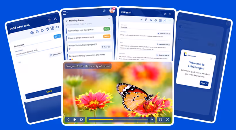
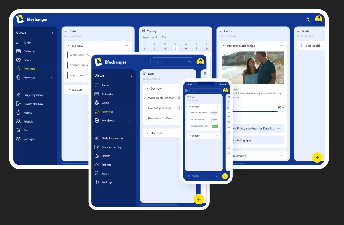 The Lifechanger app on multiple devices
Timeline and Project phases
My part in Lifechanger’s development ran from its inception in mid‑2018 until early 2024. I was the sole frontend developer on the project, within a small team in Adaptabi (1 frontend, 1 backend, 1 QA), effectively acting as Senior Frontend Engineer & UX lead.
On the product side I worked directly with the client, the owners of Lifechanger. I would receive raw requirements, analyse them, challenge incoherent flows, propose alternatives, and then design and implement the final UX/UI. On anything related to the client-facing application, I was the main decision-maker.
Business pivots and UX impact
The product went through three distinct phases:
2018–2020: Power users after coaching sessions
The original target group were “ready‑trained” power users: people who had gone through an intensive life coaching program and would now rely on Lifechanger as their central tool. The UX assumed high motivation and a willingness to manage a lot of structure and configuration.2020–early 2022: Targeting other life coaching professionals
When the initial business launch failed amidst Covid, the client pivoted towards selling the platform to other life coaches. This led to new requirements around bespoke application branding, including custom item and list types, custom fields, custom colors, configuration seeding, and more.From early 2022: General public
When the B2B angle also failed, the target switched again, this time to the general public, with no assumed prior knowledge of the product’s special concepts. This invalidated large parts of the original UX, which had been designed for trained, motivated power users. Many of the advanced flows were now overwhelming.
To adapt, we stripped down several features, simplified flows, and redesigned all forms and main screens. For the last UI transformation we hired a professional designer for a few months. I collaborated closely with them, translating their designs into a feasible UI, pointing out constraints, and ensuring that the final result stayed functional and maintainable. Visually, it was a massive improvement:
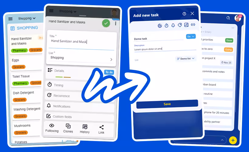 Lifechanger app UI evolution
Technical scope and shared ownership
On the technical side, me and the backend engineer worked closely to built the offline‑first architecture at the heart of Lifechanger. We brainstormed on most of the data shape, storage and flows back and forth between the client and server, to ensure network usage efficiency and perceived application performance. The resulting system handled vast amounts of data (for such an application) with ease, reaching thousands of daily active users at project peak with no performance issues.
My responsibilities included:
- UI development using
React,CSS, micro-animations and cross‑platform interactions (web + Cordova) - State management using Redux for UI and RxJS for larger data (the tasks themselves)
- Co‑designing the
data modelandsync strategies - Co‑designing and implementing the
recurrence and timezone systemfor tasks:- Handling DST, timezone changes, and tasks created in one timezone but executed in another
- Surfacing unavoidable edge cases clearly in the UI, e.g. ordering tasks and showing both “task time” and “local time” where needed
- Implementing a
dedicated web workerthat precomputed calendar data in the background so that common navigation patterns felt snappy. It involved cache design and invalidation strategies to ensure both speed and correctness, e.g. when a task’s recurrence rules were updated.
- Designing a custom Drag and Drop behavior that had to perform butter smooth on weak devices displaying thousands of items on a single screen.
Constraints in practice
The main constraints throughout the project were:
Budget and team size– We were only two developers and one tester. There was some room for experiments but they costed time.Constantly evolving specifications– The client iterated on concepts, flows, and details. Changes would sometimes create conflicting user journeys, so I had to push back, redesign flows, and/or clarify what would actually work in the product.Performance under heavy UI load– The client wanted to fit a lot of information on single screens: tens of lists with potentially hundreds of tasks each, including nested lists, Eisenhower matrices and calendar views. Keeping this responsive on both desktop and mobile devices required deliberate architecture, careful state management, and dedicated performance work.
Within these constraints, I was trusted to decide what was technically feasible, where to simplify, and how to present complex functionality in a way that still felt approachable to the end users.
Designing forgiving interactions: custom tap vs drag detection
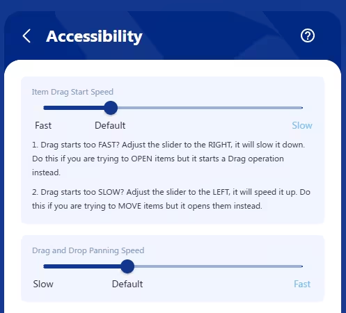 Lifechanger’s Accessibility settings screen
One of the subtle but important UX challenges in Lifechanger was the dual behaviour on tasks:
Tapa task to open its details/edit form in an overlaid panelLong‑press + dragthe same task to start Drag and Drop: the task “pops out” of the page, sticks to your cursor or finger, and can be moved (with panning) to a highlighted drop target
There is also the double-tap that toggles a task’s Done status without opening it, and is consequentially affected by this setting. I won’t insist on this part though, for simplicity.
The problem
This had to work consistently on desktop and mobile, for both “fast hands” and “slow hands”. In practice, we saw two opposite failure modes:
- Slower users would
press and hold too long, accidentally triggering drag instead of opening the task. - Faster users found it
annoying to waitbefore drag kicked in; they wanted drag to start almost immediately.
This tension is common in touch interfaces, but most apps hard‑code a compromise and move on. Some apps use a bespoke element as a drag handle on tasks, avoiding the problem — at the cost of cluttering the UI with many repeating icons that convey no useful information. Others use modifier keys e.g. Ctrl + Click, but that wouldn’t work on mobile. Therefore, we chose to treat it as an accessibility/ergonomics problem and give users control.
User‑configurable “drag start speed”
We added an “Item drag start speed” slider in the Accessibility settings. Under the hood, this controlled the allowed time between pointer down and the moment we consider the gesture a “drag start” rather than a “tap”. The slider has 3 labels on it:
Fastdrag start: as low as ~80 ms (suitable for fast, confident users)Default: about 240 ms (eyeballed as a good middle ground, slightly higher than the 200ms default tap delay on mobile)Slowdrag start: up to ~400 ms (giving slower users plenty of time to tap without accidentally dragging)
This meant that:
- Fast users could flick tasks into drag mode with almost no delay.
- Slower users could rest their finger on the screen calmly, and still open the task without fighting the UI.
Re‑implementing “click” from scratch
To support this in a cross‑platform way, I stopped relying on the browser’s default click events and implemented a custom event layer that could be attached to any React element:
1
2
3
<div {...customClick(clickHandler, { longPressHandler, ...otherOptions })}>
  {/* ... */}
</div>
This layer:
- Listened to low‑level
pointer/mouse/touch events - Combined
time thresholds(for drag start speed) withsmall movement thresholdsto:- Allow natural micro‑movement of a finger during a tap (usually around
5pxaway from the initial event location) - Avoid confusing
scrollingon mobile with dragging
- Allow natural micro‑movement of a finger during a tap (usually around
- Ensured that you
tap, then hold, then panto drag; scrolling remained possible without triggering DnD - Dealt with edge cases such as
underlying data changing mid‑gesturedue to background sync
The result was a consistent interaction model used across the app, not only where drag and drop existed, but also wherever users expected a predictable, forgiving tap/click behaviour.
Our users, especially the slow‑clicking clients who initially struggled, appreciated being able to tune the perceived responsiveness of the UI to match their own pace. It’s a small feature on paper, but it demonstrates the level of care we put into making complex interactions accessible.
A “video‑like” configurable Daily Inspiration slideshow powered by GSAP
 Daily inspiration slideshow with controls
Another distinctive part of Lifechanger was the Daily Inspiration slideshow: a guided meditation space combining user‑defined imagery, text, and background audio. At the UX level, it behaved almost like a video player:
- Fullscreen slides with meaningful background images and overlaid text content
- Background audio playing continuously in a loop
- Playback controls: previous / next / play‑pause
- A speed toggle:
0.5x,1x,2x,4x,8x - A progress slider you could drag freely; the visuals of the slideshow responded instantly, as if you were scrubbing a video timeline
- Tapping the screen toggles the video controls for a great immersive effect
Under the hood however it was much more flexible than a video, because every part of it was configurable by the user.
User‑configurable slides, sections, and audio
The content was organised in sections, each corresponding to a meditation topic (affirmations, values, goals, etc.). Users could:
- Reorder entire sections via Drag and Drop
- Reorder individual slides within a section
- For each slide:
- Choose or upload a
background image(or pick one from a curated gallery) - Edit the
overlaid textand its style (size, opacity, colour)
- Choose or upload a
Audio was handled as a playlist of user‑uploaded tracks:
- Users could upload multiple tunes
- Tracks played one after another, looping back to the first at the end
- A custom
cross‑fade effectsmoothed out play/pause transitions and song start/end, ensuringno abrupt volume changeswould startle meditating users
Data model and preloading strategy
In the settings, the slideshow was represented as a JSON structure:
- An array of
sections - Each section containing an array of
slideswith all their options (image, text, styling, etc.)
For playback, this structure was flattened into a single array of slides. Rendering then became:
- A huge horizontal container (
N * screenWidth) - Each slide occupying one
fullscreen‑sized<div>, arranged side by side
To avoid blank slides during playback, we preloaded all background images up front. This has an obvious initial cost, but it is generally paid once, and then caching makes subsequent sessions feel instantaneous, which matched the expected usage pattern (sit down, focus, and stay in the slideshow for a while).
GSAP timeline and scroll‑based transitions
The core of the playback experience was a single GSAP timeline:
- The timeline controlled the
horizontal scroll positionof the big container - The
progress slidermapped directly to the timeline’s progress:- Slider position → GSAP timeline progress → scroll position
- The slideshow auto‑advanced at the selected speed (
0.5x…8x) by playing the timeline
On the layout side, we used CSS scroll snapping on the slide containers:
- Slides stayed “locked” in place until the scroll position reached the next snap point
- Transitions between slides were a simple but effective
fadeover the current image
This approach turned out to be extremely robust:
- GSAP handled even the most aggressive slider scrubbing without glitches
- The engine simply updated the scroll position; the fade animation (on
opacity) is GPU‑friendly and highly performant
Low‑level audio work on constrained APIs
On mobile, audio was implemented using the Cordova Media plugin, which exposes a very minimal API:
play,pause,seek- Querying current time and total duration
- Setting volume between
0and1
Everything else had to be built manually. For example:
- Detecting when a track ended, and immediately loading and starting the next one (or looping back to the first)
- Implementing
cross‑fadeon play/pause and song changes:- A separate timer gradually adjusted the volume up/down
- Handling edge cases like:
- Pausing in the middle of a fade‑in
- Resuming in the middle of a fade‑out
- Reaching the end of a song while a fade‑out is in progress
The audio timeline itself deliberately ignored slider scrubbing and speed changes; users wanted a continuous, undisturbed sound bed while they explored or replayed parts of the visual slideshow.
Overall, this feature combined:
- A fully user‑configurable content model
- A GSAP‑driven timeline with scroll‑based transitions
- Careful, low‑level audio control on top of a constrained plugin API
It looked simple to the end user (“my morning slideshow”), but it required deliberate engineering to keep it both flexible and rock‑solid.
High‑performance drag and drop with a DOM‑driven DnD manager
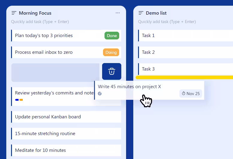 Drag and Drop operation in progress
Lifechanger’s main views were essentially Kanban‑style boards: top‑level lists arranged horizontally, each containing many tasks vertically, plus support for nested sublists. On top of that, the same drag and drop behaviour was reused in several other places, such as:
- Reordering tasks within a list
- Moving tasks between lists in the current board
- Reordering top‑level lists horizontally
- Converting lists into sublists (dropping a list inside another list)
- Promoting sublists back to top‑level
- Reordering tags in the Tags settings
- Reordering sections and slides in the Daily Inspiration slideshow settings
The UI was often extremely dense, with thousands of interactive items on a single screen. Off‑the‑shelf React DnD libraries either couldn’t handle the performance requirements, or were too rigid for our constantly evolving UX. I ended up designing a custom Drag and Drop Manager focused on three goals:
- Minimal re‑renders
- Minimal layout thrashing
- Reusable outside of React if needed
Centralised DnD manager with explicit registration
Instead of a hook‑based approach, the final design used a DnD Manager class for complete isolation. An instance was passed down via a custom React Context, and components registered their participation explicitly, usually from ref callbacks:
register.container()
Registers the top‑level container that defines the DnD “world” and panning boundaries.register.verticalPanning()
Marks an element as a vertical panning target. When the pointer approaches its top or bottom edge during a drag, the manager scrolls it vertically, at a speed derived from a cubic bezier easing function. This is how long lists and settings pages auto‑scroll while you drag an item.register.horizontalPanning()
Marks a horizontal panning target, typically the Kanban board itself, so it can scroll left/right while dragging. Same easing applies.register.dragSource()
Registers an element that can be dragged, along with its metadata (e.g. task ID, list ID).register.dropTarget()
Registers a potential drop location, also with metadata. Tasks were both drag sources and drop targets; dropping a task “on top of” another task meant inserting it between that task and the previous one.register.previewElement()
Registers an absolutely positioned element used as the drag preview: a visual clone of the dragged item that follows the pointer while the original stays in place.
This API made the DnD manager agnostic of React and very flexible. Any new feature that needed drag and drop could opt in by registering its elements and metadata, without coupling the interaction logic to component structure.
DOM‑level events and opacity‑only animations
For performance reasons, the manager worked directly on the DOM:
- It attached only
three low‑level event handlersto the top‑level container:touchstart/mousedowntouchmove/mousemovetouchend/mouseup
- Everything else relied on:
- A
requestAnimationFrameloop document.elementsFromPoint()to discover what was under the pointer:- Current drop target
- Current vertical panning target
- Current horizontal panning target
- A
This meant:
- No per‑item event handlers on thousands of elements
- No expensive React re‑renders while dragging
During a drag:
Nothing actually movedin the layout:- The original items stayed where they were
- The dragged item got an overlay / CSS class indicating it was being moved
- All drop targets pre‑rendered a
drop indicatorelement (a yellow bar) with:display: blockbutopacity: 0
- When a drop target was “active” (hovered), the manager only changed
opacityto1on that indicator.
Because the indicator effectively rendered the padding between tasks, the yellow bar appeared visually between two items, even though it belonged to the bottom one.
This “opacity‑only” animation strategy is extremely GPU‑friendly: there’s no layout recalculation, just a cheap compositing change. Combined with the absence of per‑item event listeners, it kept the interaction smooth even on low‑end mobile devices with very heavy views.
Smooth auto‑panning with eased scrolling
Auto‑panning—scrolling lists or boards while dragging near their edges—can easily feel janky or unresponsive. In Lifechanger:
- The
requestAnimationFrameloop computed atarget scroll speedbased on how close the pointer was to the edge of a panning target. - A
cubic bezier easing functioncontrolled the speed:- Near the centre: very slow scroll (for precise positioning)
- Near the edges: rapidly increasing speed (to cross hundreds of items quickly)
The loop then updated the scroll position directly, independent of React. The result was a DnD experience that remained butter‑smooth and reliable even in worst‑case scenarios: large boards, thousands of tasks, weak mobile hardware, and continuously evolving product requirements.
Goal planning and early AI assistance
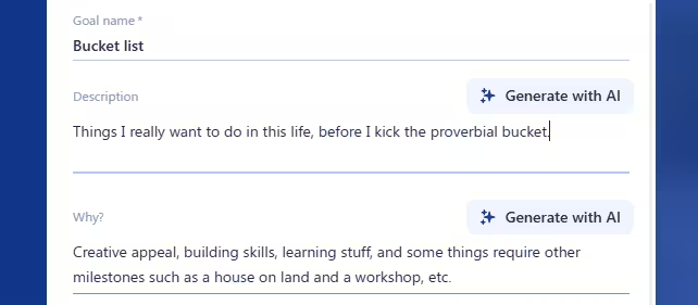 Goal form with AI buttons
Goals in Lifechanger started as special lists with a guided framework, not just a title and freeform tasks. Creating a goal walked users through structured prompts:
- What is the goal?
- Why does it matter?
- Why do it now?
- What is the current starting state?
After these, users defined Milestones. Each milestone behaved like a constrained list:
- Reorderable only within the same goal (no cross‑goal moves)
- Non‑movable out of the goal (integrity constraint)
- Assigned a configurable
weight(importance multiplier)
Tasks retained a status life‑cycle (Todo, In Progress, Done). On the server, a completion score computation:
- Aggregated all tasks across the goal’s milestone sublists
- Added them using
taskWeight * milestoneWeight, wheretaskWeight = 1andmilestoneWeightis the one configured by the user - Calculated an absolute completed (status
Done) vs total value, which the UI could present as-is or as a percentage value (configurable, of course) - Handled tasks moved temporarily to calendar planning lists without losing their linkage for scoring
A goal image banner reinforced focus: frequent visual exposure to the desired outcome. When its default checkbox is left enabled, the goal automatically becomes a slide in the Daily Inspiration slideshow — reusing the banner image as the background and the goal title as overlay text. The slideshow settings then expose a dedicated section for adjusting that slide’s text colour, size, and opacity. This tight integration keeps the goal visually present in a daily ritual, nudging consistent progress without extra user effort.
AI assistance (2023 integration)
In 2023, we added early AI support—modest by today’s standards, but impactful back then:
Generate with AIbuttons next to the initial goal question fields- Each button triggered a tailored prompt (prompt‑engineered templates) combining:
- Goal title
- Any user‑entered partial answers
- Intent (e.g. derive motivation statement, clarify starting state)
- Returned suggestions prefilled the field; users could then freely edit the fields to either accept, edit, or discard AI content.
This helped users overcome blank‑page friction and articulate motivation with more emotional clarity.
Division of work and UX design
- Backend & AI orchestration (prompt assembly, calling the model, scoring logic): implemented by the backend engineer
- Frontend:
- Designed the guided flow and progressive disclosure (questions first, milestones second)
- Implemented the Goal form UI, AI action buttons, optimistic insertion of generated text, and fallback handling if generation failed or timed out
- Ensured progress visuals (bar modes, weighted calculations) updated consistently when tasks moved or statuses changed
Notable design points
- Weighted milestone model encouraged prioritization (one high‑impact milestone could outweigh multiple trivial ones)
- Strict movement constraints for milestones preserved structural meaning (users couldn’t accidentally “detach” a milestone)
- AI confined to
assistive suggestions, never auto‑creating tasks—maintaining user agency - Progress display mode toggle (absolute vs percentage) addressed differing motivational preferences
What this project contributed to my senior frontend expertise
Lifechanger compressed years of varied frontend challenges into one sustained journey. The combination of offline‑first data flows, dense interactive UI, accessibility needs, and repeated product pivots required system‑level thinking rather than feature hacking. Key takeaways:
- End‑to‑end client-side
ownership: sole responsibility for UI architecture, performance, and UX. - Architecture under
change: kept the codebase adaptable through multiple audience pivots without collapse or paralysis. Offline‑first engineering: co‑designed replication, conflict handling, recurrence + timezone normalization, and calendar precomputation (web worker caching).Performance strategy: DOM‑level DnD manager,opacity‑only animations, GSAP timeline scrubbing, selective preloading, and background cache generation.Interaction design depth: custom tap vs drag ergonomics, adjustable thresholds, auto‑panning with eased scrolling, meditation slideshow scrubbing.Cross‑platform delivery: unified React + Cordova build, handling mobile constraints (audio API limits, touch event nuances) while retaining desktop parity.Resilience to ambiguity: translated raw, shifting requirements into coherent flows; pushed back where interaction conflicts arose.Collaboration & synthesis: integrated designer input, backend constraints, user feedback, and technical feasibility into stable UX.Abstraction mindset: reusable DnD manager and event layer instead of scattering ad‑hoc handlers; clear separation between raw data, derived caches, and view responsiveness.Tradeoff discipline: explicit choices (full image preload for slideshow vs blank flashes;opacityfades vs heavier transforms; timeline scrubbing vs per‑slide re-renders).Reliability focus: engineered for thousands of daily active users with large boards and heavy recurrence without regressions or degraded interaction quality.
In sum, Lifechanger showcases senior competencies: shaping architecture under evolving constraints, engineering performance for worst‑case scenarios, designing forgiving and accessible interactions, and aligning product intent with technical reality — all while maintaining velocity over multiple multi‑year pivots.
Thank you for reading!
 Lifechanger: Extraordinary is Achievable