Lifechanger Part 3: High-Performance UX Engineering
Deep dive into Lifechanger's UI engineering. Custom gesture handling, GSAP animations, and a DOM-based Drag and Drop manager.
This is Part 3 of the Lifechanger project series. For the high-level project overview, see Part 1: Project Overview & Impact.
Designing forgiving interactions: custom tap vs drag detection
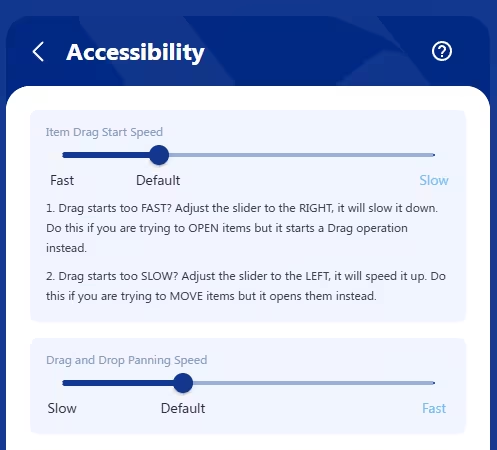 Lifechanger’s Accessibility settings screen
One of the subtle but important UX challenges in Lifechanger was the dual behaviour on tasks:
Tapa task to open its details/edit form in an overlaid panelLong‑press + dragthe same task to start Drag and Drop: the task “pops out” of the page, sticks to your cursor or finger, and can be moved (with panning) to a highlighted drop target
There is also the double-tap that toggles a task’s Done status without opening it, and is consequentially affected by this setting. I won’t insist on this part though, for simplicity.
The problem
This had to work consistently on desktop and mobile, for both “fast hands” and “slow hands”. In practice, we saw two opposite failure modes:
- Slower users would
press and hold too long, accidentally triggering drag instead of opening the task. - Faster users found it
annoying to waitbefore drag kicked in; they wanted drag to start almost immediately.
This tension is common in touch interfaces, but most apps hard‑code a compromise and move on. Some apps use a bespoke element as a drag handle on tasks, avoiding the problem — at the cost of cluttering the UI with many repeating icons that convey no useful information. Others use modifier keys e.g. Ctrl + Click, but that wouldn’t work on mobile. Therefore, we chose to treat it as an accessibility/ergonomics problem and give users control.
User‑configurable “drag start speed”
We added an “Item drag start speed” slider in the Accessibility settings. Under the hood, this controlled the allowed time between pointer down and the moment we consider the gesture a “drag start” rather than a “tap”. The slider has 3 labels on it:
Fastdrag start: as low as ~80 ms (suitable for fast, confident users)Default: about 240 ms (eyeballed as a good middle ground, slightly higher than the 200ms default tap delay on mobile)Slowdrag start: up to ~400 ms (giving slower users plenty of time to tap without accidentally dragging)
This meant that:
- Fast users could flick tasks into drag mode with almost no delay.
- Slower users could rest their finger on the screen calmly, and still open the task without fighting the UI.
Re‑implementing “click” from scratch
To support this in a cross‑platform way, I stopped relying on the browser’s default click events and implemented a custom event layer that could be attached to any React element:
1
2
3
<div {...customClick(clickHandler, { longPressHandler, ...otherOptions })}>
  {/* ... */}
</div>
This layer:
- Listened to low‑level
pointer/mouse/touch events - Combined
time thresholds(for drag start speed) withsmall movement thresholdsto:- Allow natural micro‑movement of a finger during a tap (usually around
5pxaway from the initial event location) - Avoid confusing
scrollingon mobile with dragging
- Allow natural micro‑movement of a finger during a tap (usually around
- Ensured that you
tap, then hold, then panto drag; scrolling remained possible without triggering DnD - Dealt with edge cases such as
underlying data changing mid‑gesturedue to background sync
The result was a consistent interaction model used across the app, not only where drag and drop existed, but also wherever users expected a predictable, forgiving tap/click behaviour.
Our users, especially the slow‑clicking clients who initially struggled, appreciated being able to tune the perceived responsiveness of the UI to match their own pace. It’s a small feature on paper, but it demonstrates the level of care we put into making complex interactions accessible.
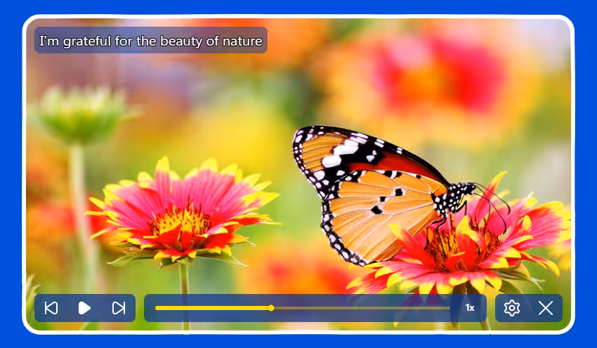
A “video‑like” configurable Daily Inspiration slideshow powered by GSAP
 Daily inspiration slideshow with controls
Another distinctive part of Lifechanger was the Daily Inspiration slideshow: a guided meditation space combining user‑defined imagery, text, and background audio. At the UX level, it behaved almost like a video player:
- Fullscreen slides with meaningful background images and overlaid text content
- Background audio playing continuously in a loop
- Playback controls: previous / next / play‑pause
- A speed toggle:
0.5x,1x,2x,4x,8x - A progress slider you could drag freely; the visuals of the slideshow responded instantly, as if you were scrubbing a video timeline
- Tapping the screen toggles the video controls for a great immersive effect
Under the hood however it was much more flexible than a video, because every part of it was configurable by the user.
User‑configurable slides, sections, and audio
The content was organised in sections, each corresponding to a meditation topic (affirmations, values, goals, etc.). Users could:
- Reorder entire sections via Drag and Drop
- Reorder individual slides within a section
- For each slide:
- Choose or upload a
background image(or pick one from a curated gallery) - Edit the
overlaid textand its style (size, opacity, colour)
- Choose or upload a
Audio was handled as a playlist of user‑uploaded tracks:
- Users could upload multiple tunes
- Tracks played one after another, looping back to the first at the end
- A custom
cross‑fade effectsmoothed out play/pause transitions and song start/end, ensuringno abrupt volume changeswould startle meditating users
Data model and preloading strategy
In the settings, the slideshow was represented as a JSON structure:
- An array of
sections - Each section containing an array of
slideswith all their options (image, text, styling, etc.)
For playback, this structure was flattened into a single array of slides. Rendering then became:
- A huge horizontal container (
N * screenWidth) - Each slide occupying one
fullscreen‑sized<div>, arranged side by side
To avoid blank slides during playback, we preloaded all background images up front. This has an obvious initial cost, but it is generally paid once, and then caching makes subsequent sessions feel instantaneous, which matched the expected usage pattern (sit down, focus, and stay in the slideshow for a while).
GSAP timeline and scroll‑based transitions
The core of the playback experience was a single GSAP timeline:
- The timeline controlled the
horizontal scroll positionof the big container - The
progress slidermapped directly to the timeline’s progress:- Slider position → GSAP timeline progress → scroll position
- The slideshow auto‑advanced at the selected speed (
0.5x…8x) by playing the timeline
On the layout side, we used CSS scroll snapping on the slide containers:
- Slides stayed “locked” in place until the scroll position reached the next snap point
- Transitions between slides were a simple but effective
fadeover the current image
This approach turned out to be extremely robust:
- GSAP handled even the most aggressive slider scrubbing without glitches
- The engine simply updated the scroll position; the fade animation (on
opacity) is GPU‑friendly and highly performant
Low‑level audio work on constrained APIs
On mobile, audio was implemented using the Cordova Media plugin, which exposes a very minimal API:
play,pause,seek- Querying current time and total duration
- Setting volume between
0and1
Everything else had to be built manually. For example:
- Detecting when a track ended, and immediately loading and starting the next one (or looping back to the first)
- Implementing
cross‑fadeon play/pause and song changes:- A separate timer gradually adjusted the volume up/down
- Handling edge cases like:
- Pausing in the middle of a fade‑in
- Resuming in the middle of a fade‑out
- Reaching the end of a song while a fade‑out is in progress
The audio timeline itself deliberately ignored slider scrubbing and speed changes; users wanted a continuous, undisturbed sound bed while they explored or replayed parts of the visual slideshow.
Overall, this feature combined:
- A fully user‑configurable content model
- A GSAP‑driven timeline with scroll‑based transitions
- Careful, low‑level audio control on top of a constrained plugin API
It looked simple to the end user (“my morning slideshow”), but it required deliberate engineering to keep it both flexible and rock‑solid.
High‑performance drag and drop with a DOM‑driven DnD manager
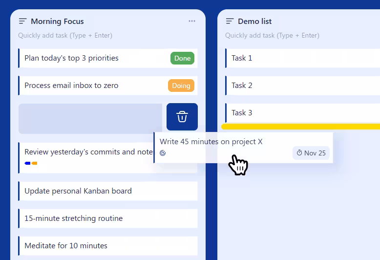 Drag and Drop operation in progress
Lifechanger’s main views were essentially Kanban‑style boards: top‑level lists arranged horizontally, each containing many tasks vertically, plus support for nested sublists. On top of that, the same drag and drop behaviour was reused in several other places, such as:
- Reordering tasks within a list
- Moving tasks between lists in the current board
- Reordering top‑level lists horizontally
- Converting lists into sublists (dropping a list inside another list)
- Promoting sublists back to top‑level
- Reordering tags in the Tags settings
- Reordering sections and slides in the Daily Inspiration slideshow settings
The UI was often extremely dense, with thousands of interactive items on a single screen. Off‑the‑shelf React DnD libraries either couldn’t handle the performance requirements, or were too rigid for our constantly evolving UX. I ended up designing a custom Drag and Drop Manager focused on three goals:
- Minimal re‑renders
- Minimal layout thrashing
- Reusable outside of React if needed
Centralised DnD manager with explicit registration
Instead of a hook‑based approach, the final design used a DnD Manager class for complete isolation. An instance was passed down via a custom React Context, and components registered their participation explicitly, usually from ref callbacks:
register.container()
Registers the top‑level container that defines the DnD “world” and panning boundaries.register.verticalPanning()
Marks an element as a vertical panning target. When the pointer approaches its top or bottom edge during a drag, the manager scrolls it vertically, at a speed derived from a cubic bezier easing function. This is how long lists and settings pages auto‑scroll while you drag an item.register.horizontalPanning()
Marks a horizontal panning target, typically the Kanban board itself, so it can scroll left/right while dragging. Same easing applies.register.dragSource()
Registers an element that can be dragged, along with its metadata (e.g. task ID, list ID).register.dropTarget()
Registers a potential drop location, also with metadata. Tasks were both drag sources and drop targets; dropping a task “on top of” another task meant inserting it between that task and the previous one.register.previewElement()
Registers an absolutely positioned element used as the drag preview: a visual clone of the dragged item that follows the pointer while the original stays in place.
This API made the DnD manager agnostic of React and very flexible. Any new feature that needed drag and drop could opt in by registering its elements and metadata, without coupling the interaction logic to component structure.
DOM‑level events and opacity‑only animations
For performance reasons, the manager worked directly on the DOM:
- It attached only
three low‑level event handlersto the top‑level container:touchstart/mousedowntouchmove/mousemovetouchend/mouseup
- Everything else relied on:
- A
requestAnimationFrameloop document.elementsFromPoint()to discover what was under the pointer:- Current drop target
- Current vertical panning target
- Current horizontal panning target
- A
This meant:
- No per‑item event handlers on thousands of elements
- No expensive React re‑renders while dragging
During a drag:
Nothing actually movedin the layout:- The original items stayed where they were
- The dragged item got an overlay / CSS class indicating it was being moved
- All drop targets pre‑rendered a
drop indicatorelement (a yellow bar) with:display: blockbutopacity: 0
- When a drop target was “active” (hovered), the manager only changed
opacityto1on that indicator.
Because the indicator effectively rendered the padding between tasks, the yellow bar appeared visually between two items, even though it belonged to the bottom one.
This “opacity‑only” animation strategy is extremely GPU‑friendly: there’s no layout recalculation, just a cheap compositing change. Combined with the absence of per‑item event listeners, it kept the interaction smooth even on low‑end mobile devices with very heavy views.
Smooth auto‑panning with eased scrolling
Auto‑panning—scrolling lists or boards while dragging near their edges—can easily feel janky or unresponsive. In Lifechanger:
- The
requestAnimationFrameloop computed atarget scroll speedbased on how close the pointer was to the edge of a panning target. - A
cubic bezier easing functioncontrolled the speed:- Near the centre: very slow scroll (for precise positioning)
- Near the edges: rapidly increasing speed (to cross hundreds of items quickly)
The loop then updated the scroll position directly, independent of React. The result was a DnD experience that remained butter‑smooth and reliable even in worst‑case scenarios: large boards, thousands of tasks, weak mobile hardware, and continuously evolving product requirements.
Explore the Architecture
These interactions were only possible because of a robust offline-first architecture running underneath. If you haven’t read it yet, check out how we built the engine:
Thank you for reading!
Lifechanger was a journey of constant learning and adaptation. If you enjoyed this deep dive into its engineering challenges, feel free to reach out—I love discussing complex frontend architectures and UX engineering.