Creating my logo
The story behind my monogram logo
Introduction: A Logo with a Mission
As a software developer, most of my work revolves around structure, clarity, and problem-solving. I’m often deep in systems and codebases, thinking through logic and ensuring everything runs smoothly. But every now and then, I enjoy stepping into a more creative space—one that lets me express ideas visually rather than functionally.
Recently, I took on a personal challenge: to design a monogram that combines my initials, T and S, in a way that feels clean, intentional, and elegant. I wanted a mark that looked as if it had been drawn by hand, but was also efficient under the hood: simple to render, easy to scale, and made with the least SVG code possible.
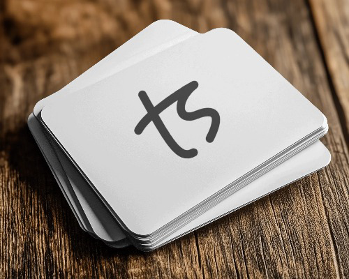
The result is the monogram you see in the sidebar. It’s now part of my branding, from my business card to my favicon. But more than the final design, it’s the journey that brought it to life that I want to share here: how a technically-minded developer approached a design challenge, using a careful balance of creativity and constraint.
Why a Monogram?
Every developer eventually starts thinking about personal branding. Whether it’s polishing a portfolio, refining a resume, or building a blog, there’s a moment when you realize that how things look matters just as much as how they work. For me, that realization led to a simple idea: what if I had a mark that was uniquely mine?
A monogram felt like the right direction. It’s personal without being loud, and it fits anywhere from a favicon to a footer. I wanted something that could live across my projects and quietly signal a bit of identity and care.
Of course, creating one was easier said than done. I don’t have a background in design, and most of my creative work happens in code editors, not on canvases. So my goal became clear. I would try to create a shape that felt elegant, but was built with the same mindset I bring to my code: minimal, thoughtful, and clean.
From Idea to Ink: Drawing the Shape
For the mark to feel hand-drawn, it would look almost like a signature: personal, flowing, and a little playful. This led me to a concept widely used in fonts which is a ligature. So the letters would not just touch, but flow naturally one from the other.
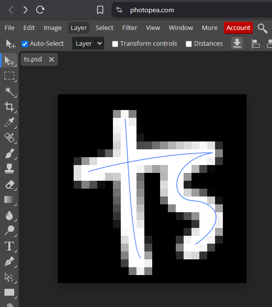
To sketch the initial idea, I turned to Photopea, a browser-based tool similar to Photoshop. It gave me just enough flexibility to experiment without getting lost in complexity. More than that, it natively handles PSD files and can export SVGs while Photoshop can’t.
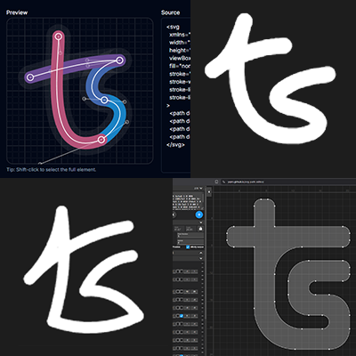
The early versions were a bit rough. I joined the letters both at the top of the S and the bottom as in the first picture above, but it ends up being too interpretable in ways I don’t intend it to - it gives it a downward direction rather than an upward slant. I then strayed in a more geometric style but a bottom ligature just didn’t work.
The next ligature I tried used the cross on the T, and I instantly knew I was on the right track. It’s pixelated because I like having a 24dp preview while drawing (force of habit from iconography), but the potential was clear:
Refining the Vector: Tools and Tweaks
With the base shape in hand, the next step was simplifying the code while keeping the visual character intact. This was where the technical side of me took over and straightened things out a bit.
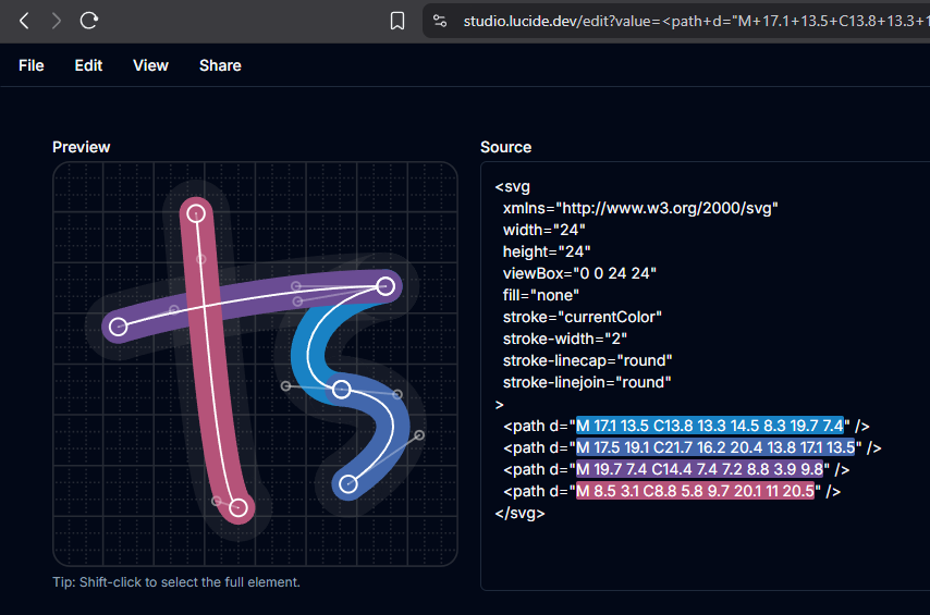
I imported the SVG exported from Photopea into Lucide Studio, which gave me a clean interface to inspect anchor points and tweak the curves in a precise way. One of my main goals was to round almost all coordinate values, trimming off unnecessary decimal points. This not only made the path data smaller, but also helped ensure crisp rendering when scaled down to tiny sizes, like a favicon.
Every adjustment was a balancing act. Round too much and the curves lose their smoothness. Keep too many decimals and the path becomes bloated. I kept editing it until I liked the design in the preview just as much as the path code in the editor. Took me a while.
This phase became a kind of code-adjacent craftsmanship. I wasn’t writing lines of Javascript or React, but I was still thinking like a developer: looking for the cleanest possible solution that didn’t compromise on intent or functionality.
Minimalist Mastery: Optimizing the SVG
Now it was time for the final trim. Lucide Studio automatically splits paths into separate SVG tags, but that’s not the most efficient.
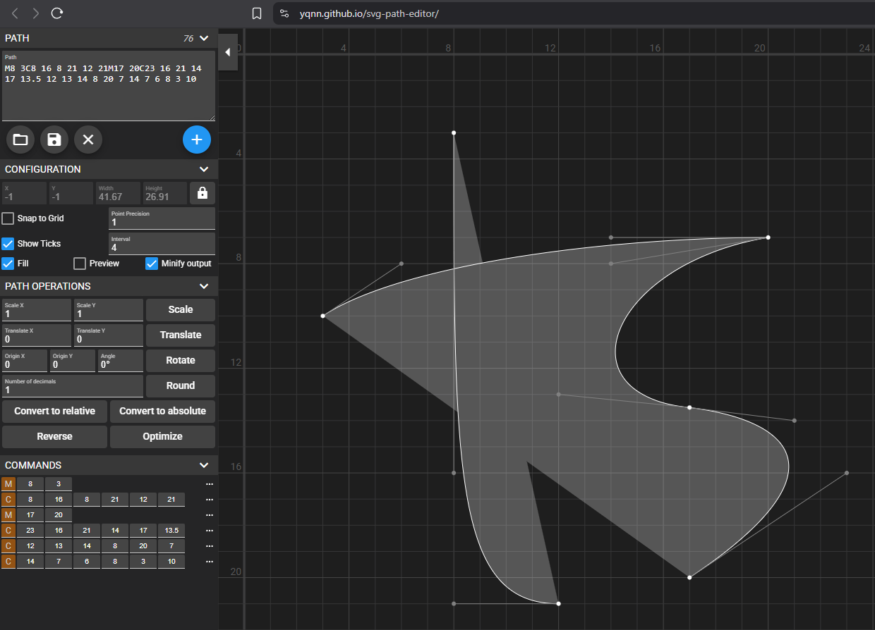
To clean it up, I used the SVG Path Editor, a tool that gives you full control over the raw path data while showing live visual feedback. It cannot replace Lucide Studio as it only renders filled shapes instead of stroke, but I used it to merge the paths and compress the code using the Minify output checkbox.
This was the moment it really came together. The design had started as a sketch, but now it was distilled to its simplest, most efficient form. It was the tiniest bit of SVG describing something fluid and expressive.
The final version rendered beautifully at every size, from a crisp favicon in the browser tab to a bold standalone graphic. The path is not only clean and compact, but also a satisfying read. I mean, to me this is poetry:
1
M8 3C8 16 8 21 12 21M17 20C23 16 21 14 17 13.5 12 13 14 8 20 7 14 7 6 8 3 10
Lessons Learned and Why It Matters
This little project taught me more than I expected. I didn’t just end up with a nice piece of branding, I walked away with a deeper appreciation for the overlap between design and development. There’s something incredibly satisfying about taking a visual idea and refining it with the same mindset used in writing good code.
It reminded me that simplicity is hard. Stripping something down to its essentials takes time, care, and a lot of editing. But the result is always worth it. Whether it’s a component, a function, or a favicon, minimalism done right makes things feel effortless, even when they’re anything but.
This also reflects how I think about tiny details. A favicon is barely visible in most contexts, but knowing that mine is well-crafted gives me the same kind of satisfaction as shipping a feature with no bugs. It’s not about visibility, it’s about intent.
And to that end, there’s also a very tiny detail that a very keen eye would pick up as a mistake. It’s meant to reflect that imperfection is natural, and sometimes acceptable rather than costly perfection when it doesn’t add real value to users. Effectiveness is not perfection.
The Result
After all the work, I finally had something I was proud of. A clean monogram that represented both my initials and my approach: thoughtful, versatile, and quietly expressive.
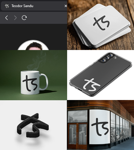
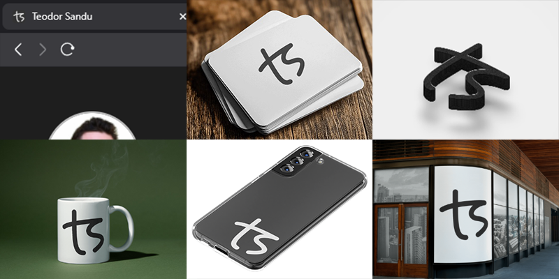
The final version now lives in multiple places. It’s the favicon on my site, the logo on my business card, and the signature mark I’ll probably keep around for a long time. It holds up at different sizes, works on light or dark backgrounds, can be made 3D, embossed, engraved or even embroidered, and looks just as good zoomed in as it does tucked away in a browser tab.
Takeaways
If you’re a developer who usually leans more technical than visual, I highly recommend trying a small design project like this. It doesn’t need to be perfect, and it doesn’t even need to be public. But going through the process of shaping something visually, and then refining it with the same care you’d apply to your code, is a great way to sharpen your eye and flex a different kind of creativity. Here are a few things that helped me along the way:
- Start with a sketch, not with code. It’s easier to shape a visual idea when you’re not thinking about syntax right away.
- Use the right tools for you. I used the ones linked above, but everyone has their preferred toolkit. Just make sure the tools you use have the right features for you to achieve the desired results. If not, embrace the challenge of looking up new ones.
- Round your coordinates. It makes SVG paths shorter, and avoids fuzzy rendering at small scales. Want to be pedantic? If coordinates are dividable by 3 they’re on pixel at
24dp,16dpand8dp. - Zoom out often. What looks great up close might fall apart when scaled down. This is especially important if you’re designing a favicon or icon.
- Treat it like refactoring. You’re not just reducing complexity, you’re revealing clarity.
Whether you’re designing a monogram, tweaking a logo, or just exploring SVG, there’s value in approaching visuals with a developer’s mindset - and vice versa.
Final Thoughts: A Shape That Says Something
In the end, this wasn’t just about making a logo. It was about putting intention into something small, and letting that reflect how I work. The monogram now feels like a quiet signature, one that says “I care about the details, even the invisible ones.”
As a developer, it’s easy to get caught up in functionality and forget how much thought can go into the surface. But this project reminded me that code and design aren’t opposites. They can inform each other, sharpen each other, and make each other better.
So now, every time I see that tiny icon in the corner of my browser, I get a small reminder of what I value. Simplicity. Elegance. And a bit of fun in the process.
Thank you for reading!
