Uncover hidden gems on mouse move with CSS
Ok ok, and a pinch of JS! Btw, there's an easter egg in here.
Objective
I sometimes enjoy a little easter egg in websites. It makes them feel more personal and intimate, it’s as if what I discover is something the author put there just for me. Of course it’s not just for me, but mathematically speaking the set of people who find it is a strict subset of the total website visitors. That makes me feel good, so I thought I’d spread the good vibes around.
So I set about implementing an easter egg on this very article page. There are many things that can be done, but what I wanted for this exercise is:
- to hide a graphic somewhere (my logo, for instance)
- to reveal it on mouseover, making it like you’re looking for it with a flashlight
Granted, this won’t be possible on touch-only devices, but hey, not everything needs to be cross-platform.
Inspiration
Chris Coyier has a neat article showcasing how to easily translate the current mouse position into CSS variable values. I just love this kind of solutions: simple, agnostic, compact, and at the same time unlocking endless styling opportunities. I mean imagination is really the only limit, see this awesome website for example: https://digitalden.cloud.
One can use this technique to implement all kind of mesmerizing effects, but I thought I’d start small, just for some hands-on experience. So Javascript takes care of interactivity, now for the second part: only revealing a part of the graphic as the user moves above it. It’s like looking through a tube, but with soft outer edges.
SVG path clipping is a great way to cut holes in graphics, because we can then make use of a gradient to smooth out the edges of our backlight, obtaining the effect we’re after.
Development
Actually, SVG path clipping doesn’t really work like looking through a tube, or shining a flashlight at a colored shape in the dark and lighting it up. But rather like having a piece of paper, cutting out the shape from it, then shining a colorful light from behind it. The shape will be revealed in the color of the backlight, much like the images in the linked post above show through the shapes svg had cut in a layer of the web page.
The CSS will do just that: apply a clipping mask to an element, and a gradient to its :before pseudo-element, which is absolutely positioned and will move along with the mouse by translating the layer according to the CSS variables that JS is setting.
The JS also needs a bit of tweaking though, as we need it to consider the context of our element within the document. So instead of applying the raw coordinates from the mouse move event, we need to subtract the offset of our element (its position on the web page) and half of the element’s width and height in order to center the gradient on the mouse location. I did this by calling getBoundingClientRect() on the element in the event handler. It’s a good generic solution that will get the job done, but it’s hardly performant. There’s some clear optimization paths, but I’m leaving this as an excersize for a later date.
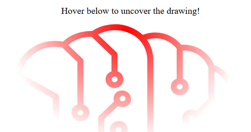
Result
For a trial run I picked out a free SVG path (well, that’s an .ai file but it’s easy to convert), ran it through SvgOmg and then tweaked it a bit in my favorite SVG path editor.
Below you can check out the end result. As for the actual easter egg, well, I hope you’ll find it!
Enjoy!
See the Pen CSS vars + JS - uncover hidden SVG by Teodor Sandu (@teosan) on CodePen.