SVG icons, stroke outline and reverse paths
About SVG web application icons, and how to cut out holes in solid SVG shapes using reversed paths.

Context
In the world of web application iconography, SVG icons are the latest and arguably best option so far. This post is about the icons you typically see in a toolbar, a sidebar, or on controls in a web form, and are usually small (24dp is the standard) and single color – i.e. not the big ones in infographics or on content cards.
Let’s first explore a couple of approaches, then we’ll get into the meat of the subject - on stroke outlines and reverse paths. Dots will connect in the end.
In Javascript web applications it’s common practice to abstract away the SVG container and define icons using only the contents. This avoids repetitive code, decreases bundle size and consequentially provides an easier way to create consistent icons in a library, as at least some settings are reused across all icons. So, at this moment I have knowledge of two major approaches when it comes to drawing icons: filled and stroked paths.
Filled paths
This approach relies on SVG’s flood fill algorithm to draw shapes with no stroke. The markup is extremely light, as the <svg> element needs only to provide the viewBox and the <path> usually provides fill="currentColor". This allows apps to control the color of the icon by simply styling the svg element and giving it a color.
A great example of this approach is the Material Design Icons library. This is how a very basic icon might look like, after stripping unnecessary fluff:
1
<svg viewBox="0 0 24 24"><path fill="currentColor" d="M10,7V9H12V17H14V7H10Z" /></svg>

Pretty compact, right? That’s what a very simple icon depicting the digit 1 looks like. Quite elegant, that’s why I like it and have contributed a few icons to the library myself.
Stroked paths
The other approach is one I found while snooping around ShadCN. They use Lucide icons, which caught my attention by using stroke-width on their paths. It’s an amazingly flexible system and the icons are beautiful, but there are some pros and cons to this approach:
- while it achieves shorter paths by not having to draw the outline of a shape that could more simply be expressed as a stroked path (as in the example below), the markup is still larger due to all the extra attributes it requires. If they are dynamically generated this may not matter much.
- while it allows great variations on
stroke-widthbesides color, there are problems when trying to fill shapes - it only works on certain icons. - you can fiddle with other attributes such as
stroke-linecapto get a different yet consistent style, but results may vary as authors cannot possibly design each icon to look great for every possible attributes combination. And once you encounter an icon for which your style doesn’t work, you’re pretty much stuck.
This is how the same icon as above would look like in the Lucide way, again with fluff removed:
1
<svg viewBox="0 0 24 24" fill="none" stroke="currentColor" stroke-width="2" stroke-linecap="square" stroke-linejoin="square"><path d="M10,8H13V16"/></svg>
As you can see, only by drawing the inner path and configuring a stroke we can get the exact same shape. This is customized though, as the default stroke-linecap and stroke-linejoin attributes are round in Lucide, so you actually couldn’t draw that square shape in their Lucide Studio.
But I love their look as far as outline style icons are concerned, and I like the minimalistic paths. Whenever possible I recommend using them, but if you need filled shapes or a style that cannot easily be derived from this technique, I would advise looking elsewhere.
Part two: stroke outline
Ok, now let’s get into some technical details. Given a path drawn with some stroke-width, then a stroke outline is a set of paths that describe the edge of the stroke. The number of paths needed to describe the stroke outline increases with the complexity of the initial path, i.e. the number of intersections.
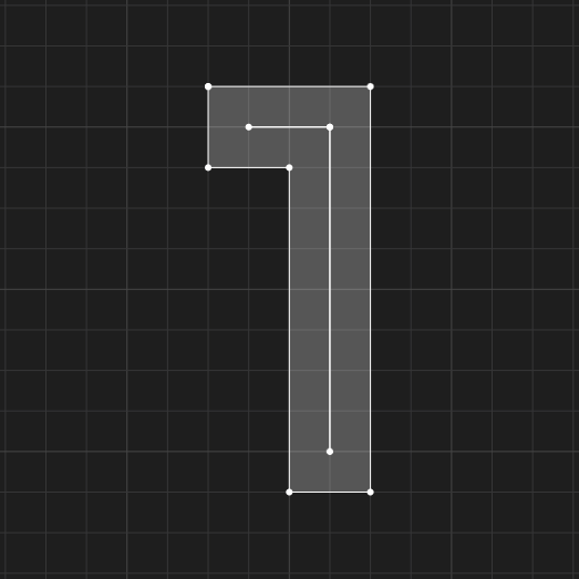
 This path needs one path to describe its outline
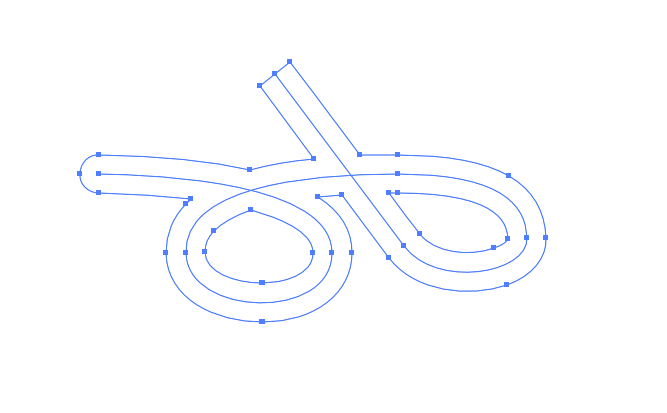 Two intersections make the outline require 3 paths
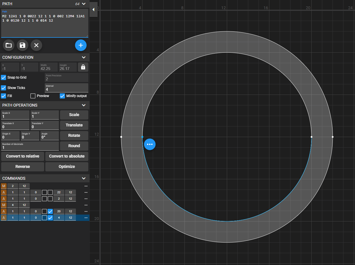
So in a fill-based icon library, strokes are created by using stroke outline paths. Sounds simple, right? For instance, drawing a circle is as easy as drawing two circles with the same center and different radiuses, corresponding to the stroke width. But here’s the twist:
1
M2 12A1 1 0 0022 12 1 1 0 002 12M4 12A1 1 0 0020 12 1 1 0 004 12

What’s gone wrong here? Well, the circle is not being hollowed-out because of the way the fill algorithm works by default. In a nutshell:
Fill performs area addition for paths running in the same direction (here counter-clockwise) and area subtraction for paths running in opposite directions.
More in-depth information in the fill-rule attribute spec. So in order to fix the issue, all we have to do is draw the inner circle clockwise:
1
M2 12A1 1 0 0022 12 1 1 0 002 12M4 12A1 1 0 0120 12 1 1 0 014 12
Reverse paths
Now you see how reversing paths becomes useful. The previous example is the easiest one I could think of, but for more complex paths it’s not always this trivial. Most vector graphics software have some sort of outline stroke feature which will split a path into multiple paths describing its outline, but they usually drawn in the same direction. Only advanced or expensive software have a dedicated reverse path direction feature.
When the path is more simple such as a solid filled shape, we can just duplicate the initial path, scale it down (or up, as needed), reverse its direction, and append it to our initial path, thus obtaining a hollowed-out shape. You see where this is going.
Reversing the path direction is the tricky bit, and luckily there’s an online tool for doing just that, free and simple. And the result is something like this:
See the Pen SVG single path outline stroke by Teodor Sandu (@teosan) on CodePen.